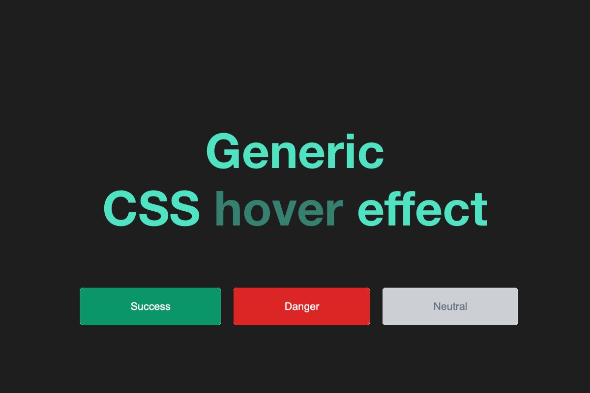
Recently I was working on a button component. This button had various styles that were changing its color. For example, the success button was green, danger was red, and neutral was gray:
See the Pen Generic CSS hover effect #1 - Basic buttons without hover by Michał Tynior (@mtynior) on CodePen.
Having multiple styles, I had to figure out how to change button appearance on hover or disabled states. Usually we define explicit values, but I wanted something generic. Something that would work with every button's style that was already defined, and with those that will be added in the future.
After quick research and some experimentation, here is what I ended with.
Brightness filter
Almost all modern web browsers support CSS filters. One of those filters allows to change the brightness of an element. This filter requires only one value, the brightness level. The value of 100% means that the element will have a "normal" brightness. If the value is lower, the element will be darker. And if value is higher than 100%, the element will be lighter:
See the Pen Generic CSS hover effect #2 - Brightness filter by Michał Tynior (@mtynior) on CodePen.
This is super easy to implement, but there is one issue when the gray button is on light background, for example - white. When user hovers on that button, it will basically become white and will merge with the background.
One of the solutions might be to use lover brightness to make the button darker on hover. But keep in mind that if you have a dark button and dark background, with lover brightness there will be same issue.
In summary, the brightness filter is easy to use and might be suitable in some scenarios, but it will not work for a component that might be use in different environments.
Opacity mask layer
Another option I experimented with was opacity. And I'm not talking about changing the opacity of the button itself. No, I'm talking about adding an opacity mask to the button.
To add this opacity layer, the .btn class needs to be extended with the position: relative;. This allows to position the layer inside the button. The layer itself is added to the button using the ::before pseudo-element. The layer basically fills the parent, but it is invisible. This is because the opacity of the layer mask is set to zero. The opacity is being change when user hovers over the layer, and this results as a mask that is above the button's content:
See the Pen Generic CSS hover effect #3 - opacity layer mask by Michał Tynior (@mtynior) on CodePen.
This solution requires a little bit more code, but works with every button's style and with every background color.
I hope this short article and the examples were useful, and you will be able to add a generic css hover effect in your project.
Comments
Anything interesting to share? Write a comment.