Last week, I showed the minimalistic Christmas Card made with HTML, CSS, and SVG. One of the elements of this card was the CSS animation of floating hearts. In this article, I would like to show you how I did it.
HTML structure
<div class="hearts">
  <div class="heart"></div>
  <div class="heart"></div>
  <div class="heart"></div>
  <div class="heart"></div>
</div>
The HTML structure is pretty simple. The parent div has a hearts class - which we will explore later - and a couple of children `divs`. Each child has a class of `heart` and represents a single heart in the animation. In total, there will be four hearts that are going to float in the air.
Hearts container
The first thing we need to set is the container’s size. The width and height use percentage values. It allows the container to adjust animation elements to the size of the viewport (browser). The min-width and min-height ensure the animation will be visible when the container is tiny:
.hearts {
   width: 5%;
   min-width: 100px;
   height: 25%;
   min-height: 250px;
}
The last part is the position of the container. Usually, we want to move the container to a specific place, so we use the absolute option. Also, we want it to be visible on top of all elements, so we set the z-index to a high value:
.hearts {
   // ...
   position: absolute;
   z-index: 10;
}
We should end up with something like this:
See the Pen Animated hearts #1 by Michał Tynior (@mtynior) on CodePen.
The background-color has been added just to show how the container looks like. We will remove it when we add the hearts, which we are going to do next.
Hearts
Similarly to the container, we set the normal and minimal sizes:
.heart {
  height: 20%;
  min-height: 25px;
  width: 20%;
  min-width: 25px;
  //....
}
In the next step, we transform a div into a heart using the CSS mask-image. Here, the property uses an SVG heart image - taken from Font Awesome - and applies a heart-shaped mask onto a div. The mask-image works nicely with the background-color, so we can easily set the heart to the color red:
.heart {
  // ...
  background-color: red;
 -webkit-mask-image: url('data:image/svg+xml;charset=UTF-8,<svg xmlns="http://www.w3.org/2000/svg" viewBox="0 0 512 512"><path fill="currentColor" d="M462.3 62.6C407.5 15.9 326 24.3 275.7 76.2L256 96.5l-19.7-20.3C186.1 24.3 104.5 15.9 49.7 62.6c-62.8 53.6-66.1 149.8-9.9 207.9l193.5 199.8c12.5 12.9 32.8 12.9 45.3 0l193.5-199.8c56.3-58.1 53-154.3-9.8-207.9z"></path></svg>');
         mask-image: url('data:image/svg+xml;charset=UTF-8,<svg xmlns="http://www.w3.org/2000/svg" viewBox="0 0 512 512"><path fill="currentColor" d="M462.3 62.6C407.5 15.9 326 24.3 275.7 76.2L256 96.5l-19.7-20.3C186.1 24.3 104.5 15.9 49.7 62.6c-62.8 53.6-66.1 149.8-9.9 207.9l193.5 199.8c12.5 12.9 32.8 12.9 45.3 0l193.5-199.8c56.3-58.1 53-154.3-9.8-207.9z"></path></svg>');
  // ...
}
Unfortunately, themask-imageproperty is not widely supported, so we still have to use the-webkit-mask-imageextension to make it work on Chrome.
The mask-image works similarly to the background-image and requires a couple of adjustments. The first one is mask-repeat. If the provided image is smaller than the containing element, it will repeat itself to fill the remaining space. We don’t want this for our hearts, so we set it to the no-repeat. The no-repeat will apply the mask only once in the middle of the div. Usually, this is the desired effect, but floating animation will go from bottom to the top. So we need the heart’s position to the bottom of the div using mask-position: bottom:
.heart {
  // ...
  -webkit-mask-repeat: no-repeat;
          mask-repeat: no-repeat;
  -webkit-mask-position: bottom;
          mask-position: bottom;
}
If everything is set up correctly, we should see a red heart:
See the Pen Animated Hearts Step #2 - Hearts by Michał Tynior (@mtynior) on CodePen.
Animation
Let's start by adding some changes to the heart class:
.heart {
  // ...
  opacity: 0;
  animation: floating-heart 10s infinite cubic-bezier(0.5, 0.5, 0.5, 0.5);
}
First, we set the opacity to zero. We want the animation to handle the visibility of each heart, so we need to hide them before everything starts. Then we add the floating-heart animation. Each pass will take 10s and will infinitely repeat itself. The cubic-bezier timing function will make the heart’s movement smooth.
Now, let’s define our animation:
@keyframes floating-heart {
  0% {
    opacity: 0;
    bottom: 0%;
    left: 0%;
  }
  10% {
    opacity: 1;
    bottom: 20%;
    left: 70%;
  }
  20% {
    bottom: 40%;
    left: 10%;
  }
  30% {
    bottom: 60%;
    left: 50%;
  }
  40% {
    opacity: 1;
    bottom: 80%;
    left: 5%;
  }
  48% {
    opacity: 0;
    bottom: 100%;
    left: 60%;
  }
  100% {
    opacity: 0;
    bottom: 100%;
    left: 90%;
  }
}
The animation changes the two elements of each heart: opacity and position.
Before animation starts, the hearts are invisible. As the animation progresses, the opacity gradually changes to 100%, then goes back to 0 at the end.
The position of each heart is determined by the bottom and left margins. During the animation, a heart goes up and swings from left to right.
Some might wonder why animation key-frames end around 50% and jump to the 100% point. The CSS doesn’t allow to delay the next iteration of a repeating animation. This needs to be done manually and can be achieved by splitting animation keyframes into two stages. During the first stage, the actual animation is being played. During the second stage, nothing happens, which gives an illusion of a delay.
There is one last problem to solve. If we play the animation right now, we can see only one heart is moving, but we have defined four of them. That's because all the hearts are on top of each other. What we want to achieve are the hearts moving after another. Fortunately, this can be achieved with the animation-delay:
.heart:nth-child(1) {
  animation-delay: 1s;
}

.heart:nth-child(2) {
  animation-delay: 2.5s;
}

.heart:nth-child(3) {
  animation-delay: 3.5s;
}

.heart:nth-child(4) {
  animation-delay: 4.5s;
}
Animation for each heart gets its delay, which will make an illusion of hearts floating after another:
See the Pen Animated Hearts Step #3 - Animation by Michał Tynior (@mtynior) on CodePen.
Using it in a scene
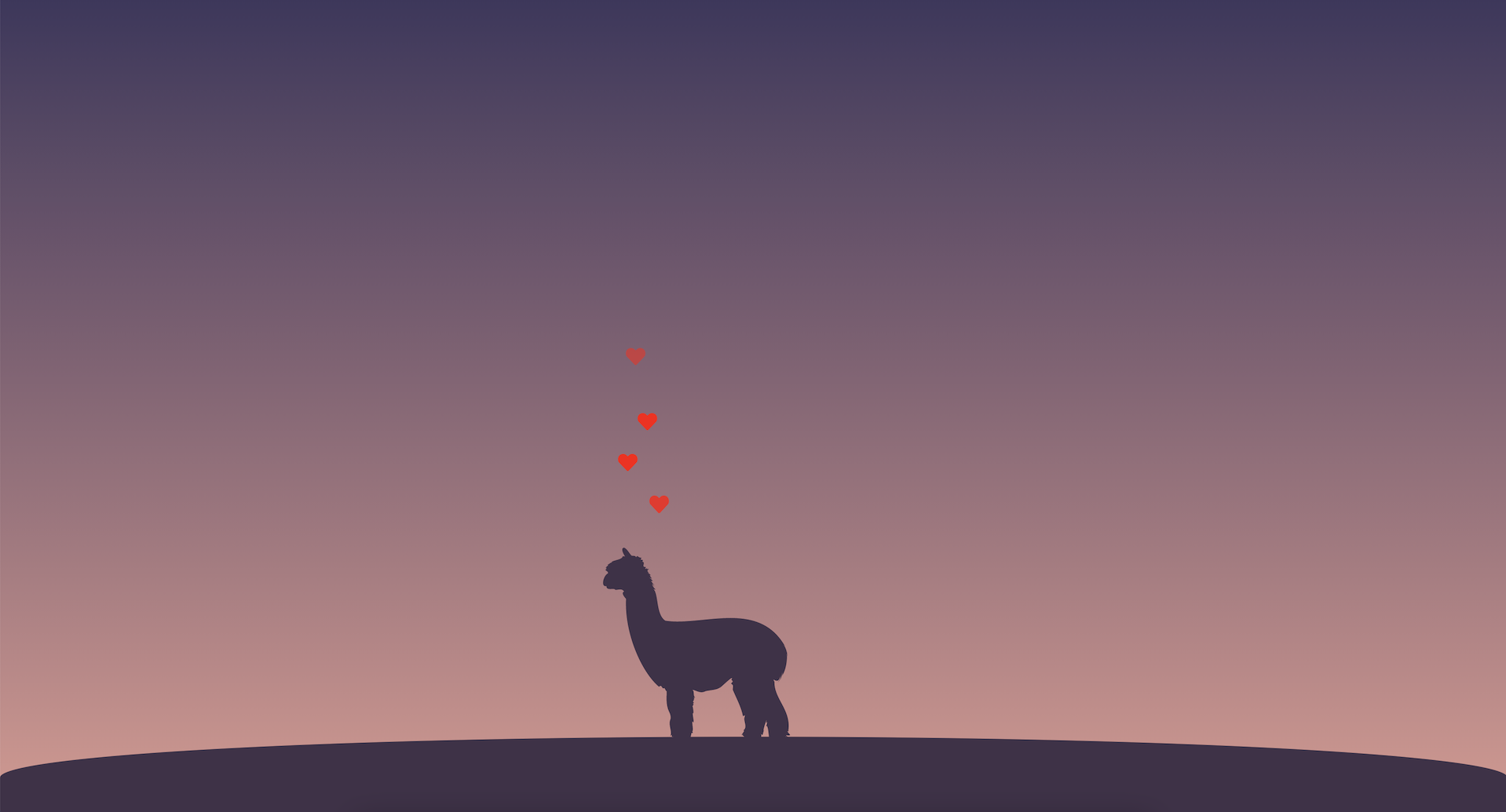
Once the animated hearts are ready, they can be used in an actual scene:
See the Pen Animated Hearts Step #4 - Final scene by Michał Tynior (@mtynior) on CodePen.
The scene above is pretty simple. The linear-gradient, used as a background, adds a nice feel and look of a sunset. The alpaca is an SVG artwork that is anchored to the top of a landscape. The landscape itself is anchored to the bottom of the page. It also has rounded corners, so it looks like the alpaca is staying on top of a hill.
The animated hearts are inside a container div, which is placed above the alpaca’s head with the left and bottom margins.
Comments
Anything interesting to share? Write a comment.